Garmin Vivomove Trend
MSRP $270.00
“The Garmin Vivomove Trend hybrid smartwatch’s fashionable design looks superb, and Garmin’s free health and activity platform challenges the best. But the price puts it right up against some serious competition.”
Pros
- Hybrid, fashionable design
- Hidden screen is clear and sharp
- Comprehensive health platform
- No ongoing subscription fee
- Wireless charging
Cons
- Reflective screen hinders visibility
- Slow responsiveness
- Standard strap isn’t very comfortable
The Garmin Vivomove Trend is not a typically sporty Garmin smartwatch. Instead, it’s a lifestyle hybrid smartwatch. This means it’s more about matching it to your outfit before heading out for yoga than it is about sweating it up a storm during a triathlon.
Take a look at Garmin’s promotional images for proof, as the models have perfectly manicured nails, are holding coffee, or wearing a suit. In our review, we find out if this means it has lost any of the impressive sporting ability we associate with Garmin products, or if it does everything you could want with an under-the-radar design.
Garmin Vivomove Trend: design
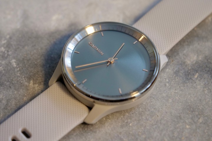
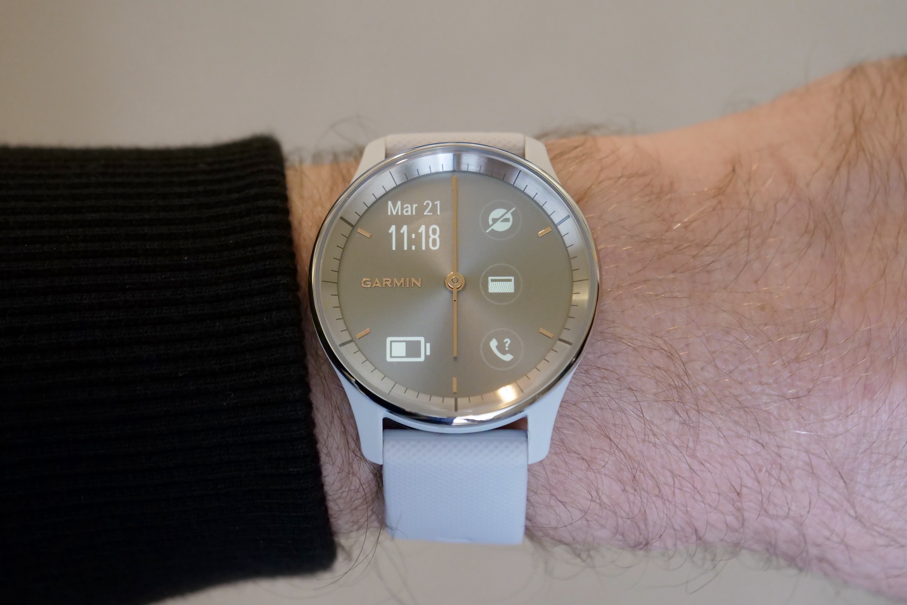
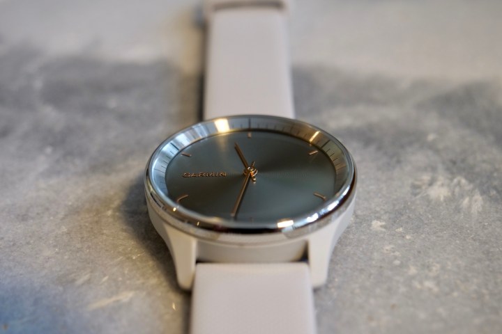
Garmin has got the unisex design, the case size, and the weight exactly right. The Vivomove Trend will suit most people, and most wrist sizes too. The 40mm case is made from fiber-reinforced polymer (posh name aside, it feels like plastic) with a stainless steel bezel and strengthened glass over the dial — for a total weight of 43 grams. This is a hybrid smartwatch, so it has real watch hands set over a cleverly disguised LCD screen that you won’t know is there until it lights up.
My review model is in Mist Grey with a silver bezel, but I was surprised to find the handset and the indices are in gold, which isn’t immediately obvious from some of the photos. It doesn’t look bad, but it does make the Trend quite dainty and makes more of a statement than is necessary. That said, I think it looks fine on my 6.5-inch wrist, and have had compliments about its style. You can get the Trend in two different shades of gold, or in a simple black too.

The LCD screen takes up the entire dial, unlike the small OLED screen on last year’s Vivomove Sport. When it’s off, it takes on a partial sunburst-like look, giving the face a very watch-like design. From a distance, it could easily be mistaken for a traditional fashion watch from a brand such as Swatch. I like the way the Garmin logo and six indices give the dial depth, without taking away from its minimalist design.
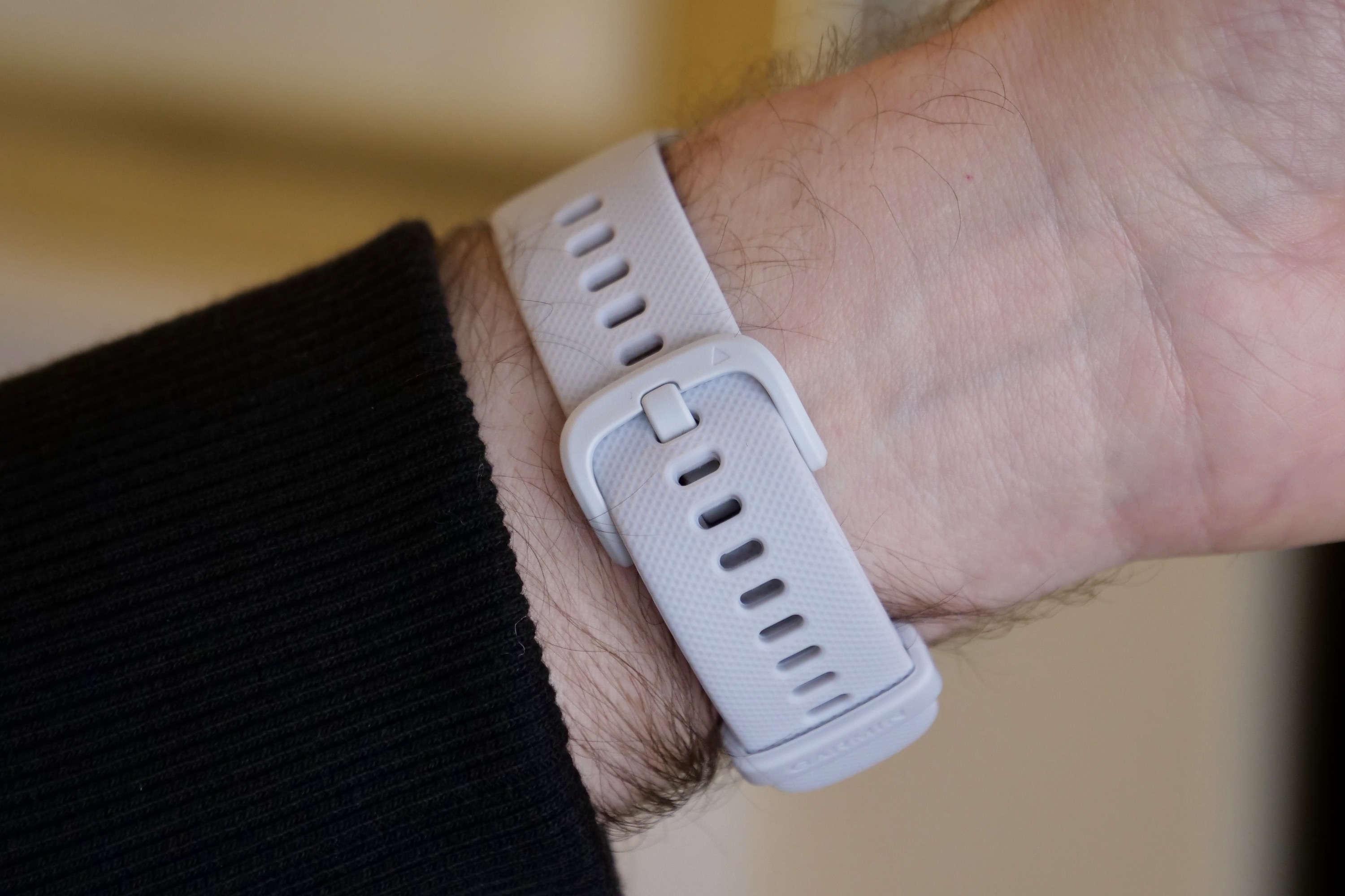
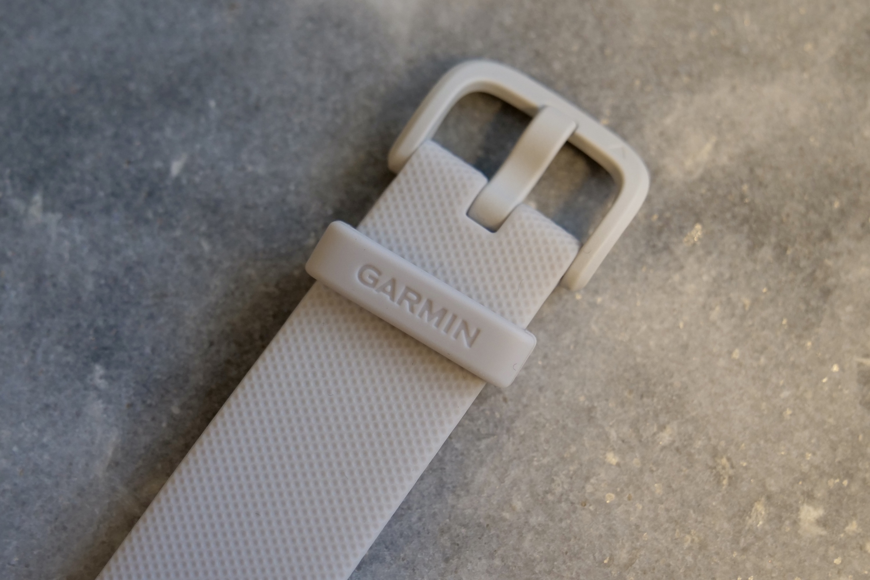
I’m less taken by the silicone band. It has very little give in it, and its stiffness makes it a little uncomfortable to wear overnight. I’m constantly aware of it being on my wrist, which I find distracting. It’s a standard 20mm band with quick-release pins, so it’s easy to change if you feel the same, but this does not happen with the Sport Band or Sport Loop on the Apple Watch Series 8, for example.
Garmin Vivomove Trend: screen and controls

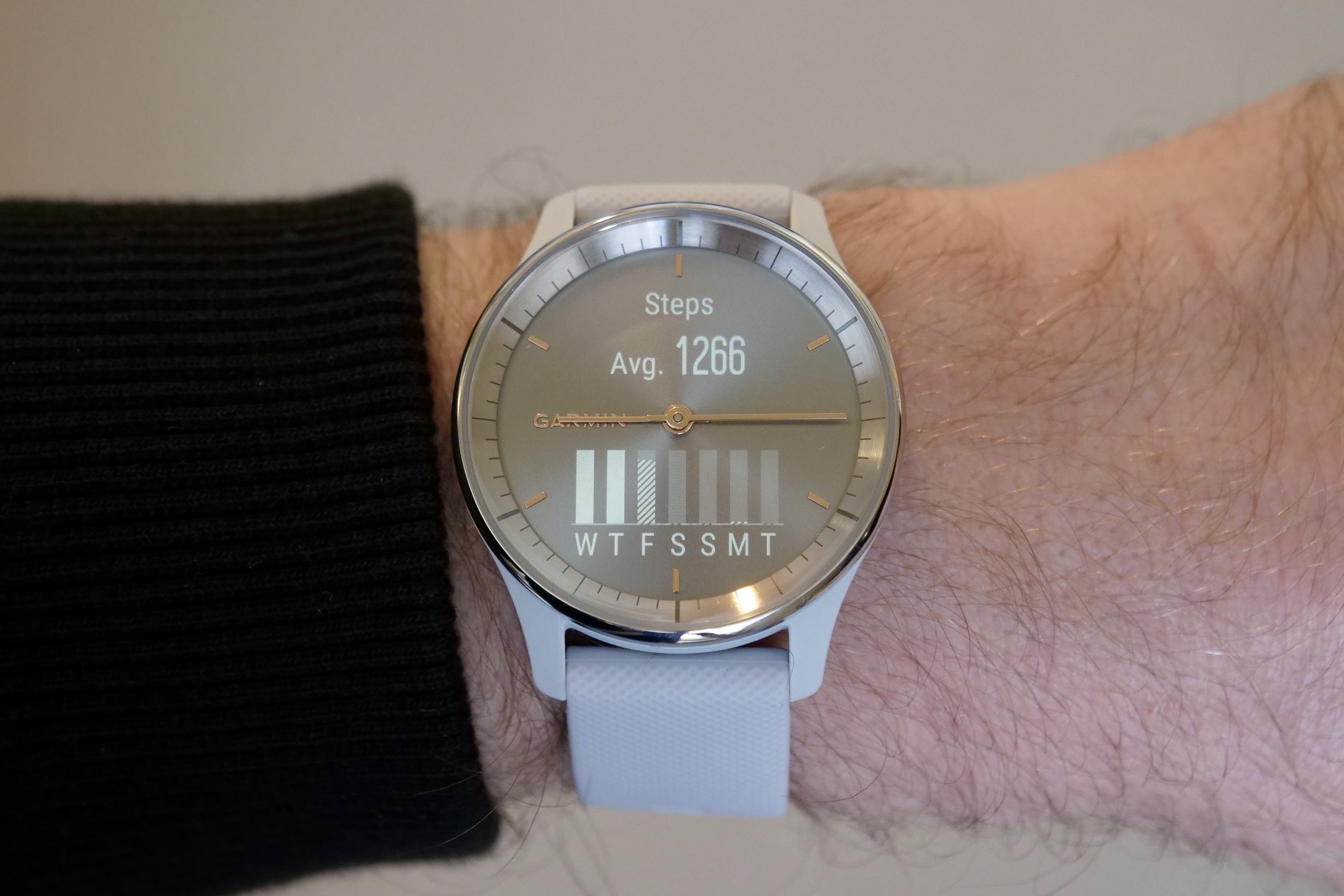
The 1-inch screen has a 254 by 346-pixel resolution, and shows up in a single “color,” so don’t expect it to take on the Apple Watch or the Samsung Galaxy Watch 5. It’s clear and sharp, so text is easy to read, which is helped by the way the hands rapidly move aside so information is never obscured. There are no physical buttons on the case (more evidence this is not a smartwatch for seriously sporty people), and you control the watch’s interface through taps and swipes on the glass.
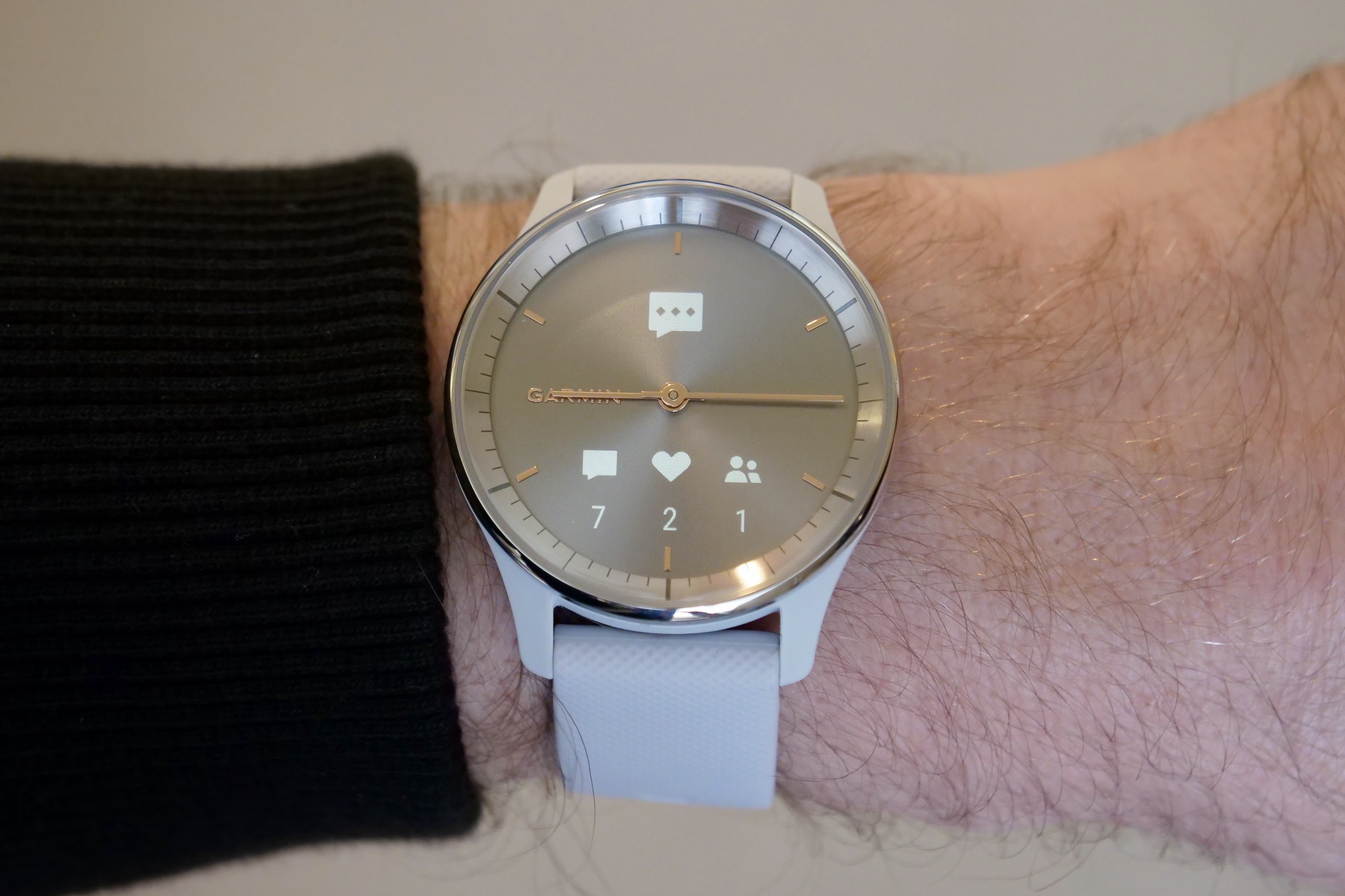
A single tap shows your chosen watch face, a longer press shows the main menu, and swipes show current health and activity data. It’s responsive, and you can change the sensitivity if it’s not responsive enough, but it can take a while to get used to the controls. When a notification arrives you can tap it to show more, and you can recall recent messages with a downward swipe on the dial. It’s surprisingly comprehensive, even connected to an iPhone.
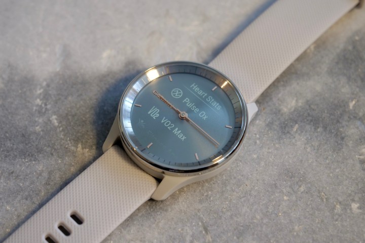
The Vivomove Trend has an automatic brightness level, which I’ve used during my review period, and although it’s accurate, it does take a moment to adjust. The screen is very reflective, and the screen needs a boost to see any information in bright conditions, meaning that beat before the screen increases in brightness can be frustrating. You can manually set the brightness to a permanently higher level, but this will drain the battery faster.
The lack of physical controls makes interacting with the watch more difficult during exercise. The touch-sensitive glass requires more precision than a button, and it doesn’t work if you’re wearing gloves. Like the design, the control system suits someone who casually exercises.
Garmin Vivomove Trend: Garmin Connect app
Andy Boxall/Digital Trends
Andy Boxall/Digital Trends
Andy Boxall/Digital Trends
Just because the Vivomove Trend’s design and controls aren’t suited to hardcore athletes, that doesn’t mean it’s lacking in the health tracking department. There’s a heart rate sensor on the back, it measures your blood oxygen levels and examines stress and respiration too. You can wear it overnight to track sleep, and there are features to manually track menstrual cycles, hydration, and mindfulness sessions.
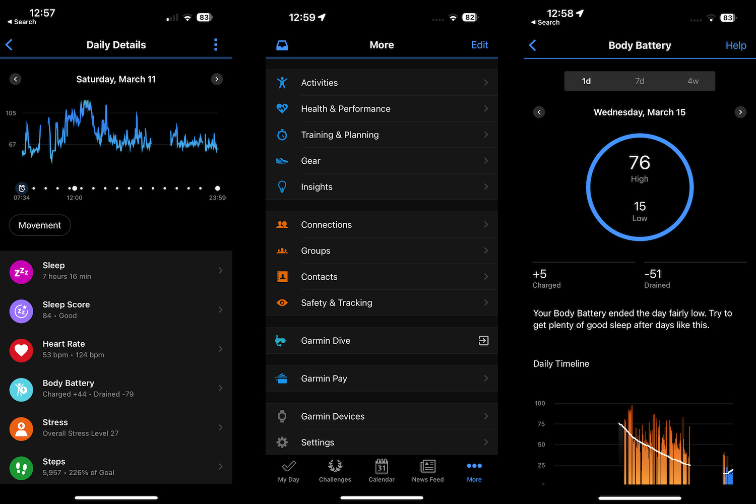
The Vivomove Trend connects to the Garmin Connect app on your phone, where you see all relevant data and Garmin’s clever Body Battery metric. It makes use of the GPS on your phone, and there are various activities to track (including swimming), plus it has automatic workout recognition. There are masses of ability here. I’ve used it with an iPhone 14 Pro, and it has been completely reliable and was very simple to set up.
Best of all, Garmin’s entire platform is all yours, forever, without suddenly needing to pay a monthly subscription.
The app is fairly well designed, although there is a lot of information presented on the main My Day page, all in one long, scrollable list. It can be overwhelming at first. The focus is on your heart rate, steps, and daily calorie burn, but scroll further down to see a lot more detail, including your sleep patterns and workouts.
Garmin’s Body Battery is very interesting, as it estimates your daily readiness and the amount of energy you either have for the day — or that you’ve expended. This gives a handy, glanceable metric on how you should spend your day, either actively or taking a break.
There’s no specific, motivational tool like Apple’s Ring system. The Body Battery provides a different kind of motivation, allowing you to be the judge of how to make the most of the day. Dig deeper into the app, and there are training and planning sections, a lot of historical data, the ability to create a personal activity should it not be listed in the app, and safety systems that alert emergency contacts if you need assistance. Best of all, Garmin’s entire platform is all yours, forever, without suddenly needing to pay a monthly subscription to continue using all the features.
Garmin Vivomove Trend: workout and sleep tracking
Andy Boxall/Digital Trends

Andy Boxall/Digital Trends
Andy Boxall/Digital Trends
Andy Boxall/Digital Trends
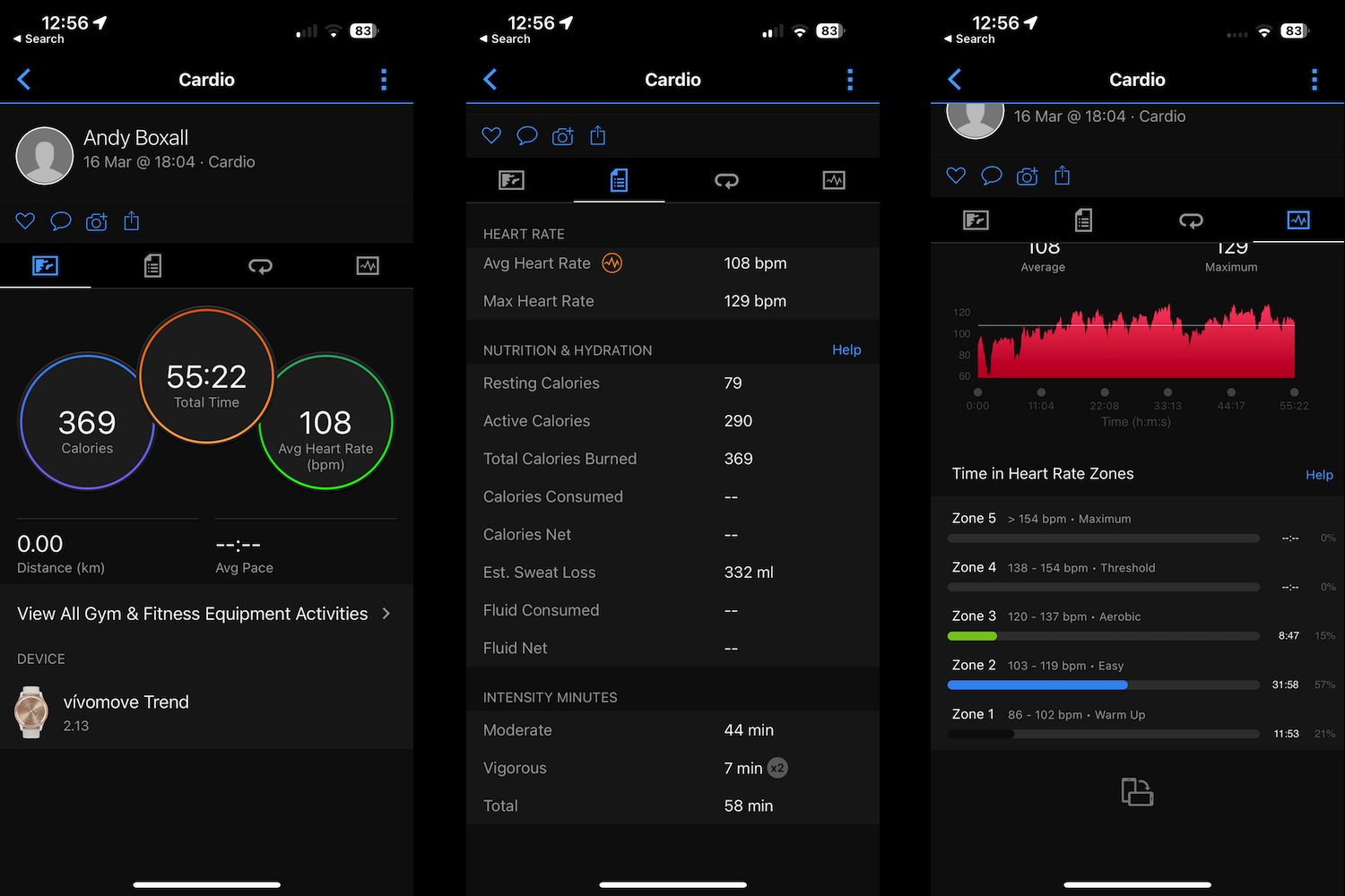
The Garmin Vivomove Trend may not look the same as a Garmin Forerunner 955 or have quite the same technical ability, but the app provides all the same features, so there’s room for growth over time. I’ve found the tracking system to provide similar results to the Apple Watch Ultra during exercise. As neither are medical devices, one is not necessarily more accurate than the other, but the general agreement between them is reassuring.
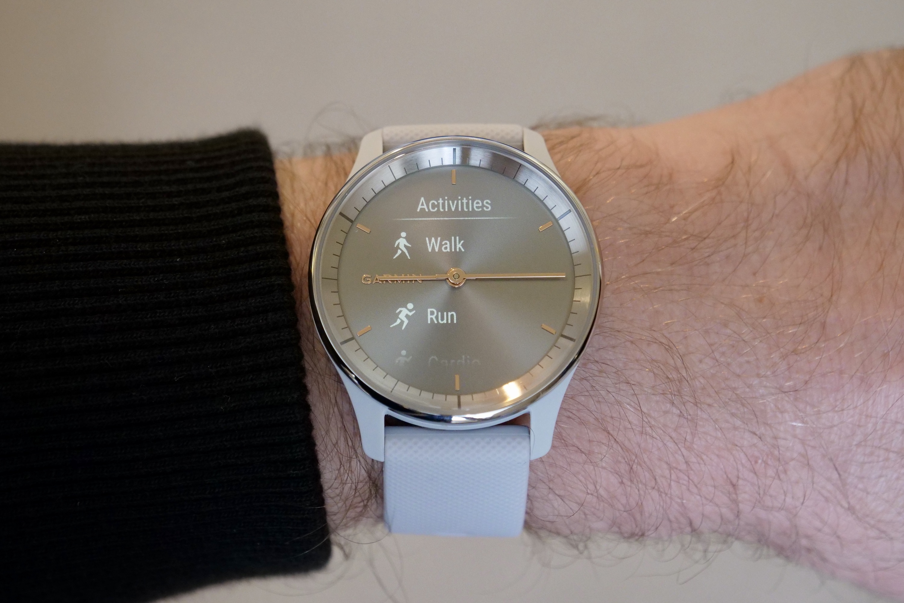
It’s a comfortable, simple-to-use tracker. Tap the screen twice to enter the main menu, then select Workout, and your chosen activity. It’s a double tap to start and stop the tracking. During a workout, you have to wake up and swipe the screen to see your current metrics, which are restricted to your time elapsed and heart rate. This is a little awkward, hence recommending this more for casual use. The Connect app sends you a notification once a workout has been saved, which encourages you to look at your data after the workout, instead of during. Runners who want more immediate details should look at an alternative such as Garmin’s Forerunner series, or an Apple Watch.
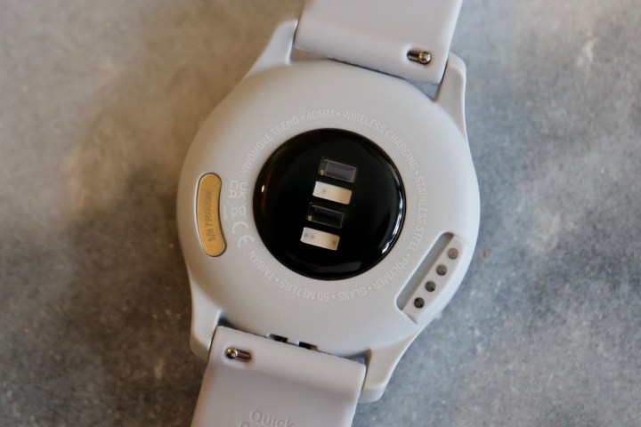
The relatively unforgiving strap made wearing the Vivomove Trend a little uncomfortable at night, but the app does provide comprehensive details, so it’s worth persevering. It breaks your sleep down into stages, plus it shows blood oxygen levels, resting heart rate, and respiration.
The results did differ somewhat from the Oura Ring, usually around the amount of time spent in REM sleep or awake. Both have very different ways of presenting data but usually agreed on the total time spent “asleep” or, at least, in bed. The discrepancies may come from not wearing the smartwatch tight enough against my wrist, a consequence of the uncomfortable strap.
Garmin Vivomove Trend: battery and charging
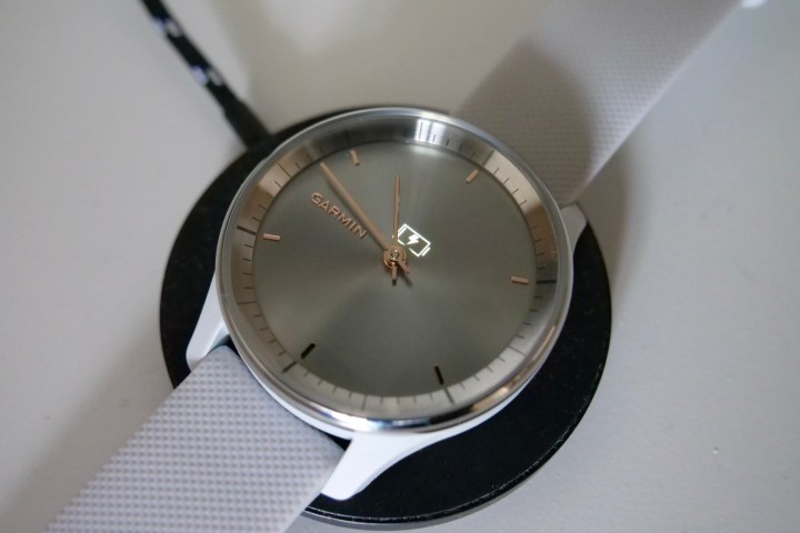
You can use a Qi wireless charger to charge the battery in the Vivomove Trend, in addition to the bundled proprietary connector. How useful you find this will depend on how you charge your phone or other devices. If you already use wireless chargers, it’s convenient, provided you have more than one. If you don’t or don’t use wireless charging much, then it won’t change your life.
The proprietary charger securely clips onto the side of the watch, and it takes more than an hour to charge the battery. The Qi wireless charging compatibility means if you lose the charging clip you won’t necessarily have to buy another, and that’s a considerable benefit. While it hasn’t transformed my life with the Vivomove Trend, the addition of Qi wireless charging is a sensible step forward.

The battery lasts approximately five days with all health tracking features active, a couple of hour-long workouts without GPS tracking, and sleep tracked too.
Remove any of these, and the battery will last a little longer. This is in line with Garmin’s estimates and is longer than the Apple Watch Series 8 and the Samsung Galaxy Watch 5, but both these have full-color, always-on touchscreens.
Garmin Vivomove Trend: price and availability
The Garmin Vivomove Trend starts at $270 for the black or Mist Grey version, while the Peach Gold and Cream Gold versions cost $300. Oddly, in the U.K., all the Vivomove Trend models cost 280 British pounds.
This is quite a lot more expensive than the $180 Vivomove Sport released at the beginning of 2022, which really impressed with its combination of a small hidden screen, reasonable cost, and fully featured app. The Vivomove Trend has a larger screen, wireless charging, a stainless steel bezel, and Garmin’s mobile payment platform called Garmin Pay.
It’s also comparable in price to the $250 Apple Watch SE 2 and the $280 Galaxy Watch 5, depending on your choice of size and band. Both these are full touchscreen watches and are technically more capable than the Vivomove Trend, but not as watch-like in their designs.
Garmin Vivomove Trend: verdict

If you want a smartwatch that doesn’t look like a smartwatch and isn’t specifically designed for the incredibly sporty — but aren’t prepared to compromise on overall ability and still want an expertly designed app — the Garmin Vivomove Trend will suit you. It’s not really a competitor to the Apple Watch or Galaxy Watch 5, which remain the best smartwatches you can buy. Instead, it’s ideal if you consider these two a bit “too much,” and put fashionable style above luxury materials or endless feature lists.
The Vivomove Trend is reliable and convenient to live with on a daily basis, the app is comprehensive and informative, yet it never bothers you with needy reminders or annoying promotions. If you’re not overly sporty, neither the app nor watch ever push you hard, and instead, leave it mostly down to your own judgment, motivation, and intention as to how much you exercise or improve on your goals. However, all the capability you could want is still there, and all the while, the unobtrusive, cool design looks good on your wrist with most outfits, and in most situations.

Andy Boxall/Digital Trends
Andy Boxall/Digital Trends
Andy Boxall/Digital Trends

Andy Boxall/Digital Trends
Understanding this is where the Vivomove Trend’s strengths lie is crucial to knowing if it’s for you. If you want lots of motivation, physical buttons, a detailed always-on screen when exercising, built-in GPS or cellular connectivity, and a construction that will handle a weekend’s tough mudding, it’s not really the right choice. Take a look at the Apple Watch Ultra, the Garmin Forerunner 265, or the Galaxy Watch 5 Pro instead. Runners should also look at the $300 Polar Pacer Pro. One last thing, if you like the look and the concept behind the Vivomove Trend, and don’t care about wireless charging or Garmin Pay, the Vivomove Sport seems to still be available and is a lot cheaper.
Provided your lifestyle and exercise demands align with the Vivomove Trend’s features and design, then it’s a recommended buy. You get all the Garmin platform’s subscription-free goodness inside a very pretty hybrid smartwatch.
Editors’ Recommendations

