Microsoft Windows 11
MSRP $140.00
“Thanks to both a fresh look and some meaningful upgrades, Windows 11 fits in with most workflows and lifestyles.”
Pros
- Modernized design changes
- Powerful new multitasking features
- Greatly expanded Microsoft Store
- Android apps finally on the PC
- Improved touch experiences
Cons
- Hardware compatibility issues
- Still missing some Windows 10 features
- Some legacy elements still exist
Windows 11 has been full of controversy so far. Strict hardware compatibility and early bugs after upgrading are just two things people have had issues with when trying out the latest version of Windows for free — or when installing it for the first time on new machines using a retail copy of the operating system.
But what is it actually like to use Windows 11 as your daily driver? Does it outdo the controversy? What are the big differences when looking at Windows 11 versus Windows 10? What is it like to leave behind the familiar Windows 10 and embrace the drastically different look of Windows 11? I, for one, can’t help but feel like Windows 11 is a fresh new start for Windows, even if it sometimes appears to be a work in progress.
Windows 11 2022 Update
Its first big update since its initial launch in 2021 has arrived, and it goes by a rather simple name: the Windows 11 2022 Update. Also known as 22H2, this anticipated update represents a year’s work of development and testing, all of which has happened in public through the Windows Insider Program. But now, it’s available for you to install and use. Fortunately, it feels like the version of Windows 11 that should have launched in 2021.
With the new update, you’ll find a broad range of new features for Windows 11, touching everything from simple interface tweaks to entirely new apps. The Start menu is now customizable, allowing you to switch from a view that gives more document suggestions to a view with more applications. You can also now use quick drag-and-drop actions to create folders for your apps for improved organization within the Start menu.
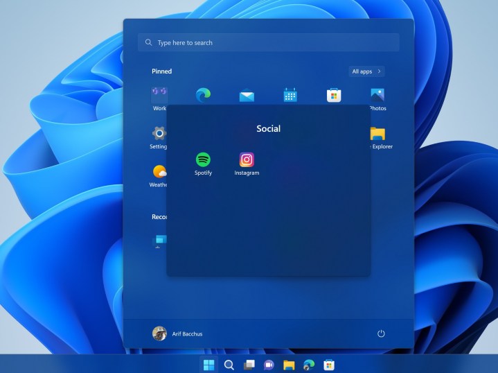
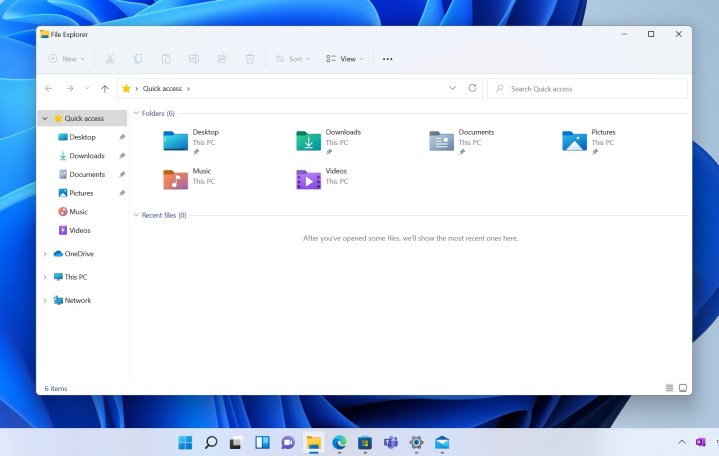
File Explorer has also received some tweaks. Tabs are coming soon (in October), but in the meantime, you’ll enjoy the ability to pin documents in the sidebar (not just folders), as well as a new home screen that gives you more relevant files that you might need to jump back into.
My favorite new feature, though, might be the new touch controls. Snap Layouts is easier to jump into now, which gives you layout options right when you drag a window to the top of the screen, rather than just automatically full-screening. You can also get right to the Start menu with a swipe up at the center or to your Quick Settings when you swipe up above the system tray. Small tweaks like these continue to improve the touch experience for Windows 11. It’s still no iPadOS, but baby steps.
And there’s far more, too. Live Captions and Voice Access greatly expand the universal accessibility tools, while the arrival of the video editing app Clipchamp fills the hole Windows Movie Maker left. There’s even been an expansion of the Android app ecosystem up to over 20,000 now, up from around 1,000.
But if you’re still on Windows 10 and wondering if the transition is really worth it in general, there’s plenty more to discuss below.
Welcome design changes
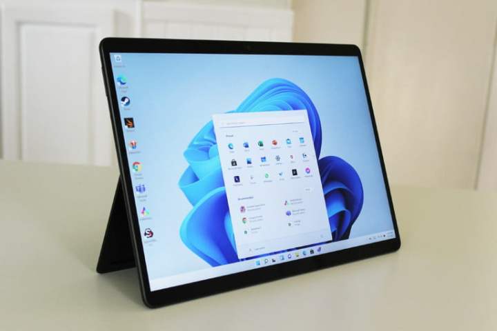
The biggest change to comes down to the way it looks and feels. Gone are flat squared edges, and in its place are more rounded corners and beautiful, glasslike effects that Microsoft says are designed to give you a sense of “calm and ease.” Whether or not that’s true, the new accents and softer edges feel like a change Windows needs, though some people might have issues with the new look.
The place where you’ll see that the most is the Start Menu. Marking a shift from Windows 10, the Start Menu is centered, rounded, and in the middle of the screen by default. And yes, it no longer features the Windows 8-era Live Tiles, which usually show previews of app notifications at a glance. These are gone for good.
With that move, Microsoft is leaving behind the Windows of the past — and I, for one, am delighted. With Windows 11, Microsoft is taking a simpler approach to the Start Menu that feels fresh, just like it did when it invented the concept in Windows 95.
All the pinned apps you need are right upfront, along with your most recent files and a search box. You’ll even see the files that matter most to you, no matter what device you have Windows on, as the files list is powered by Microsoft’s cloud. At a time when we’re familiar with tapping app icons on mobile phones, this feels like a natural fit for Windows.
Microsoft is taking a simpler approach to the Start Menu that feels fresh.
That design carries over to the Taskbar, too. Its icons are now centered, and it now matches both MacOS and Chrome OS. The change feels natural, as my eyes tend to go to the center of the screen when looking for an app.
And here’s where the controversy comes back into play. Microsoft says that this change should bring you closer to the things on the PC that you love. But if you don’t like it and are too used to Windows 10, you can still move the taskbar back or make Windows 11 look like Windows 10 with third-party programs like Start11. That program also adds many Windows 10-like features to Windows 11, including the tiled interface on your Start Menu.
And in another controversy, as fancy as these new design changes might be, they come with a small sacrifice — the bugs. In the early days, Windows 11 had many small issues. Those updating to the new operating system faced problems running basic apps, a File Explorer glitch, and even issues with AMD Ryzen Processors. If these worry you, then keep your eyes on Microsoft’s known issue page. The company is usually quick to issue fixes and is always improving on Windows.
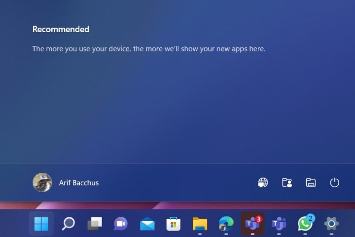
Going back to the design, though, even the animations have changed in Windows 11. As you log in to Windows 11, your Taskbar icons float in from the bottom. Opening and minimizing an app makes the icon bounce. Moving around an open window brings up a glass-like pane. Even tapping to summon right-click menus will bring a clean-looking context menu that flows through with your wallpaper. Combined with the right hardware, everything just flows more smoothly than it ever did before.
And for you folks who like to turn off the lights — Dark Mode is much more consistent. It darkens the lights in all the right places, especially in the File Explorer. After five years of Windows 10, Windows 11 feels so clean. It is something I’ve not seen in Windows since the Windows 7 era.
Even with those big changes, Microsoft’s not done with the Start Menu. Much like Windows 10 always evolved, Windows 11 will be getting once-a-year updates. Addressing missing features from Windows 10, you can now add folders to the Start Menu, see more of your pinned apps, and get a shortcut to the sign-in options page.
Productivity comes first
Every new Windows release tends to bring new features, and in Windows 11, there are several of these catered toward productivity. The list includes a redesigned File Explorer, a new Snap Layouts, and a Snap Groups feature. In more ways than one, these features are a step up from the Snap Assist counterpart in Windows 10 — ensuring that you can get the most work done.
I was excited for Snap Layouts when Windows 11 leaked, and I still am when using the final version of the operating system.
I’m a person who likes to stack my windows side by side, and with the new Windows 11 feature, I can just hover my mouse over the maximize button and group any of my open windows together. The group then gets saved to the Taskbar in a “Snap Group,” so I can get back to them very easily with a single click. This helps me save time during my day, cutting out the need to reopen multiple apps and drag them to the sides of my screen over and over again.
Windows 11 also introduces a new ability where your device remembers what you have on the screen. When I plug (or unplug) my PC into my monitor, Windows greets me accordingly. It remembers the apps I had open and will port them to the big screen as I left them, saving me time by cutting out the need to reopen the windows, as I had to do in Windows 10.
As for the File Explorer, it now has a new look. You’ll find a new bar up on the top. Controls for creating a new folder, cutting, pasting, and renaming files are front and center and clearly labeled. And, rather than stick out as they did in Windows 10, the buttons blend in nicely with the rest of the UI. From rounded corners or see-through glasslike effects, it’s clean, concise, and alive.
Heading into the future, File Explorer is going to get even better. Microsoft has started testing a “tabbed” interface for File Explorer. This lets you open tabs in the title bar of File Explorer with a new “plus” button so you can open your favorite folders without having to open them in separate windows. MacOS has had this feature for years, and Windows is now catching up.
Useful tweaks that matter
The changes I mentioned so far are just the beginning of what makes Windows 11 different. In a big change from Windows 10, Microsoft tweaked the Notification Center and introduced a Quick Settings panel. These are both now in separate spaces. In Windows 10, the two were combined, with the Notification Center having its own “Quick Actions” section built into the bottom. It is a change that matters, as it makes these areas more useful.
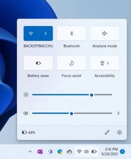
Quick Settings in Windows 11 resembles what you might get on an Android or iOS device. There are now sliders for both the brightness and the volume of your PC. The volume slider even has a pop-out menu to let you pick your output source. And if you’re listening to music, you’ll see a little player up on top of the Quick Settings, so you don’t have to go into the app itself.
It’s a massive difference from Windows 10, where you had to use tiny icons in the taskbar for common tasks. Even the Wi-Fi setting option has a pop-out menu, letting you pick networks directly from quick settings, in a space on top of what you’re working on. Though, unlike in MacOS, you can’t pick Bluetooth devices from the Bluetooth quick menu and will be redirected to your settings instead.
In another change, notifications are slimmer. You can even see the calendar or control notification settings directly from the Notification Center itself.
And with the Windows 11 2022 Update, Windows now has “Focus Session” ability built right in your notification center. This helps you listen to music and book a certain time each day of the week to relax and unwind, ensuring you’re always productive no matter what.
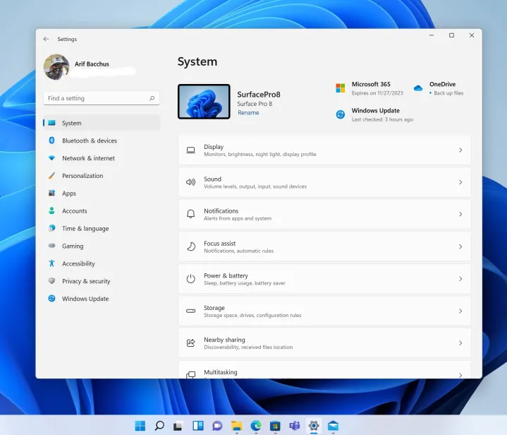
But that’s not all. One of the core areas of Windows, the Settings app, is much easier to understand in Windows 11. A sidebar now lists the most commonly accessed setting options, and redesigned settings pages make it easier to find what you’re looking for. Need Windows Update settings? Everything you need is right up front, without having to click through multiple menus.
During a busy day, those tweaks make a huge time-saving difference. It’s now much easier to control settings on my PC, without having to wonder where I need to go, or run a search in the Start Menu, or visit a settings app.
For your entertainment
While there are a ton of productivity features in Windows 11, there are also a bunch catered to entertainment. These include the new Widgets experience, the new “Chat” app in the Taskbar, and a fresh new Microsoft Store. There’s even the ability to run Android Apps in Windows 11, too.
No matter which way you look at it, Windows 11 is an operating system that not only ensures you can get work done but that you can relax and wind down, too.
Widgets are very reminiscent of the old Live Tiles from Windows 10. Hit Windows Key+W or swipe from the left of the screen and you get a new space to find information at a glance. For me, that includes my New York Mets sports scores and the weather, as well as the day’s top news. It’s a quick way to get what matters most to you, and it looks beautiful, with a glasslike background. There’s no more need to go to a web browser or pick up your phone, and in the future, you’ll even be able to enjoy third-party widgets for your favorite apps already installed on your PC.
As for the Chat app, it’s a quick and easy way to stay in touch with family and friends. Powered by the personal version of Microsoft Teams, you can start video calls, send files, and ensure that you’re not missing any of the action. No need for a download, either. Like iMessage and FaceTime on MacOS, everything is integrated right in the Taskbar for you. Microsoft even says you can chat with people who don’t have Teams, via SMS relay, with a message telling them to download the app.
The Microsoft Store, though, gets the biggest change since it was introduced in Windows 10. It has been redesigned from the bottom up. Discovering apps is easier, app listings are clear to understand, and updating apps is now a simple process thanks to the “library” area. Microsoft is even taking a page from Apple by unifying the type of apps that are available in the store.
You now find Win32 apps like the Opera web browser, PWA apps like Twitter, and traditional UWP apps like OneNote. That’s three types of apps under one roof. And, not to forget, Microsoft is also allowing third-party stores like Epic Games, so it opens the chance for more gaming opportunities.
The much-anticipated ability to run Android apps on Windows 11, however, is what is really the game-changer. Though it is limited in scope to selecting apps like Kindle and Subway Surfers and others that are downloaded through the Amazon App Store, people have found a way to expand on it more.
With the right tweaks, you can run the Google Play Store and Android apps like Instagram or Snapchat right on your PC. This isn’t endorsed by Microsoft, though, but it is possible. When we tried it, all official Android apps, as well as third-party apps, performed great, almost like they do in ChromeOS. It’s really great to see that this is now possible on Windows, too.
When software matches the hardware
A problem for Microsoft in the past has been matching hardware with software. It’s why I think Windows 11 has some very strict hardware requirements, that cut out a lot of modern PCs from running the new operating system. Microsoft wants firmer control over the hardware, just like Apple has with MacOS. It’s why you’ll need a system with an Intel 8th generation processor or newer, or an AMD Ryzen 2000 series processor or newer. Also, a factor is a TPM 2.0 chip.
But going back to matching hardware with software best example is the failure of the Surface RT and Windows 8. Now that Panos Panay is in charge of the team that handles both Surfaces, as well as Windows devices, though, Microsoft has fixed those problems in Windows 11.
The perfect example is how Windows 10’s old tablet mode is gone in place of new features in Windows 11. On a device like the Surface Pro, detaching your keyboard now brings you to a familiar desktop interface, but with touch-first tweaks. Icons are larger, spacing is improved, and the touch keyboard has gotten a redesign, with Swiftkey-like gestures and the ability to insert emojis and GIFS with the tap of a single button. You even can change the theme of the keyboard.
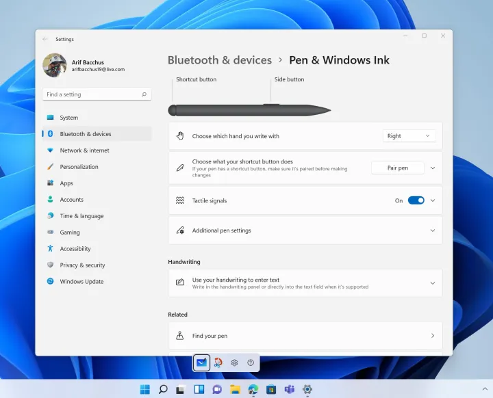
There’s even an inking menu in Windows 11 that appears right when you pick up your stylus, letting you jump into the action in your favorite drawing or writing apps. Windows 11 even has special support for haptics, letting you feel the strokes of a Slim Pen 2 Pen in your hands, just like you’re putting a pencil to paper.
Microsoft also delivered gaming improvements in Windows 11. DirectX12 Ultimate, DirectStorage, and Auto HDR are a few examples. Microsoft even says your system might feel snappier. In my tests, Windows Updates took less than five minutes to install, and there’s even a new estimated time for an update. That’s not to forget the performance benefits, too.
Thanks to optimizations in the way that Windows 11 handles apps and processes, Windows will favor your foreground tasks, and ensure they get the most system resources. Microsoft’s own test, combined with Edge’s Sleeping Tabs feature, saw an average savings of 32% for memory and 37% for CPU usage on Windows 11. I tested Windows 11 on an XPS 13, and an older Asus Vivobook Flip 14. All the devices felt snappy and fast, but Microsoft tells us performance improvements might vary based on your hardware.
It’s finally worth the upgrade
Windows 11 has been around for nearly a year, and Microsoft has worked out a lot of early bugs. Windows also always evolved based on feedback from the community, and the Windows 11 2022 Update proves that.
And if you can’t upgrade to Windows 11, don’t worry. Windows 10 will be supported through 2025. Windows 11 features like the redesigned Microsoft Store are even trickling down to Windows 10, so you’ve got plenty of time to make the leap.

Today’s tech news, curated and condensed for your inbox
Check your inbox!
Please provide a valid email address to continue.
This email address is currently on file. If you are not receiving newsletters, please check your spam folder.
Sorry, an error occurred during subscription. Please try again later.
Editors’ Recommendations


